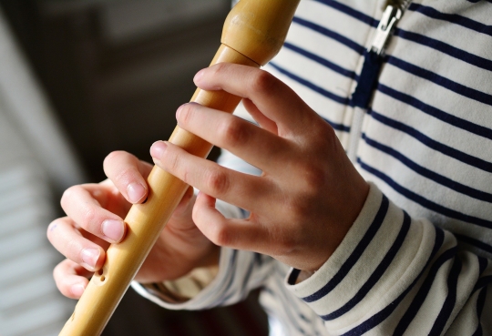
Konzert Showtime Klarinette und Saxophon
Startet ab 23.05.2023, 17:00 Uhr
Wusstest du das du dich im Zeitraum der Showtime Woche für eine kostenlose Schnupperphase anmelden kannst?
Melde dich online an und probiere ob das Instrument des Monats DEIN Instrument ist! Die Termine findest Du unten.


Startet ab 23.05.2023, 17:00 Uhr


Unsere Lehrkräfte haben eine Playlist zusammengestellt, mit der du dir ein tolles Bild vom Instrument der Woche machen kannst!
Lass dich von den Klängen inspirieren und entdecke neue Musik von unserem Instrument der Woche!


Unsere Lehrkräfte haben eine Playlist zusammengestellt, mit der du dir ein tolles Bild vom Instrument der Woche machen kannst!
Lass dich von den Klängen inspirieren und entdecke neue Musik von unserem Instrument der Woche!


Unsere Lehrkräfte haben eine Playlist zusammengestellt, mit der du dir ein tolles Bild vom Instrument der Woche machen kannst!
Lass dich von den Klängen inspirieren und entdecke neue Musik von unserem instrument der Woche!