

	<!--IFTS_NO_PARSE-->
	<!--multilang_start-->


	<!--slot:mw_default_start-->


			<div id="slot_0_0" class="uslot    ">


<section class="content-slot uslot1">
	<div class="col-lg-12 col-md-12 col-sm-12 col-xs-12 pull-left nospacing">
		<!--flexmodul: bild-->


<style>

#flex_0_0_100_1{
	margin-bottom: 30px;
}


#flex_0_0_100_1 > div::after {
	clear: both;
	display: block;
	content: "";
}

#flex_0_0_100_1 .bild{
<!-- height: 185px; -->
}


@media (min-width: 1187px) {


#flex_0_0_100_1{

				margin-top: 0px;

				margin-right: 0px;

				margin-bottom: 10px;

				margin-left: 0px;


				padding-top: 0px;

				padding-right: 0px;

				padding-bottom: 0px;

				padding-left: 0px;
		}


}

@media (min-width: 992px) and (max-width: 1188px) {


#flex_0_0_100_1{

				margin-top: 0px;

				margin-right: 0px;

				margin-bottom: 60px;

				margin-left: 0px;


				padding-top: 0px;

				padding-right: 0px;

				padding-bottom: 0px;

				padding-left: 0px;
		}


}

@media (min-width: 600px) and (max-width: 992px) {


#flex_0_0_100_1{

				margin-top: 0px;

				margin-right: 0px;

				margin-bottom: 60px;

				margin-left: 0px;


				padding-top: 0px;

				padding-right: 0px;

				padding-bottom: 0px;

				padding-left: 0px;
		}


}

@media (max-width: 600px) {


#flex_0_0_100_1 .bild img{
		width: 100%;
	}


#flex_0_0_100_1{

				margin-top: 0px;

				margin-right: 0px;

				margin-bottom: 60px;

				margin-left: 0px;


				padding-top: 0px;

				padding-right: 0px;

				padding-bottom: 0px;

				padding-left: 0px;
		}


}

@media (min-width: 580px) {


#flex_0_0_100_1 .pull-left.bild{
		padding-right: 4px ! important;
	}

#flex_0_0_100_1 .pull-right.bild{
		padding-left: 4px ! important;
	}

#flex_0_0_100_1 .pull-right.content{
		padding-left: 10px ! important;
	}

#flex_0_0_100_1 .pull-left.content{
		padding-right: 10px ! important;
	}

}

@media (max-width: 580px) {
#flex_0_0_100_1 .pull-left.bild img{
		padding-bottom: 15px;
	}

#flex_0_0_100_1 .content > div{
		padding-bottom: 30px;
	}

#flex_0_0_100_1 .pull-left.bild img{
		padding-bottom: 15px;
	}


}

</style>


<section class="content-bild   " id="flex_0_0_100_1"  style="">
	<div class="col-lg-12 col-md-12 col-sm-12 col-xs-12 pull-left nospacing">
		<div class="col-lg-8 col-md-8 col-sm-8 col-xs-12 pull-left nospacing content">
			<p>
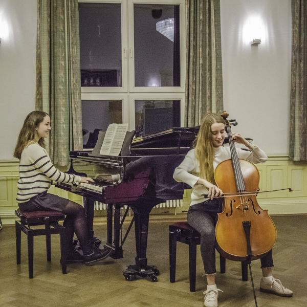
Die Musikschule bietet in der musischen Bildung mit qualifizierten Lehrkr&auml;ften sowohl hervorragende Basisarbeit und Breitenf&ouml;rderung f&uuml;r Alle, als auch auf Musikhochschulen vorbereitende Spitzenf&ouml;rderung. Hier setzt die Musikakademie als Schnittstelle an. Unsere Stipendien bieten neben regelm&auml;&szlig;ig stattfindenden Workshops und Fortbildungen einen enormen Mehrwert &ndash; auch f&uuml;r eine noch gezieltere Vorbereitung auf ein Musikstudium. So bekommen Sch&uuml;lerinnen und Sch&uuml;ler zus&auml;tzlichen Einzel- und Ensembleunterricht, Theorie und Geh&ouml;rbildung, profitieren von unseren bundesweiten Netzwerken und Kooperationen und vieles mehr. Individuelle F&ouml;rderung und ein behutsames Begleiten der jungen Talente ist uns dabei besonders wichtig. Ab 16 Jahren k&ouml;nnen sich unsere Sch&uuml;lerinnen und Sch&uuml;ler auf ein solches Stipendium bewerben. Bereits ab 10 Jahren ist zudem eine Bewerbung auf eine Unterrichtsf&ouml;rderung m&ouml;glich.</p>

<p>Bewerbungsschluss f&uuml;r das Stipendium Schuljahr 2025/2026 ist der <strong>15. Mai 2025.</strong></p>

<p>Das Bewerbungsvorspiel f&uuml;r 2025/2026 ist am <strong>02 Juli</strong> um 18 Uhr in Raum 27.</p>

		</div>
		<div class="col-lg-4 col-md-4 col-sm-4 col-xs-12 pull-right nospacing bild   " >
			<figure>

				<img src="/mb/mw/musikschule/fotos/fittosize_600_600_828_1248_0a1e5776d04c2456359fd8192f4e4224_instrumental_und_gesangsunterricht_2.jpg" class="img-responsive" title="" alt="Schülervorspielt mit einer Schülerin am Klavier und einer zweiten Schülerin am Cello">
				<figcaption>
					 © ESM
				</figcaption>

			</figure>
		</div>


	</div>
	<div class="clearfix"></div>
</section>


<div class="clearfix"></div>


<!--/flexmodul: bild-->
<!--flexmodul: wordmodul_mit_bild-->


<style>


#flex_0_0_100_2{
	margin-bottom: 30px;
}


#flex_0_0_100_2 .button_hintergrund {
    background-color: rgb(189, 15, 18);
	color: #ffffff;
}


#flex_0_0_100_2 span.icon.abs_right{
right: 30px}


#flex_0_0_100_2 .button_hintergrund {
	background-color: ;
}

#flex_0_0_100_2 .button_hintergrund, #flex_0_0_100_2 .button_hintergrund span, #flex_0_0_100_2 a {
	color: ;
	text-decoration: none;
}


#flex_0_0_100_2 > div{
	text-align: left;
}


#flex_0_0_100_2 .button_hintergrund{
	position: relative;
}


@media (min-width: 1187px) {


#flex_0_0_100_2 span.icon.abs_right{
		right: 30px	}


}

@media (min-width: 992px) and (max-width: 1188px) {


#flex_0_0_100_2 span.icon.abs_right{
		right: 30px	}


}

@media (min-width: 600px) and (max-width: 992px) {


#flex_0_0_100_2 span.icon.abs_right{
		right: 30px	}

}

@media (max-width: 600px) {


#flex_0_0_100_2 .bild img{
		width: 100%;
	}


#flex_0_0_100_2 span.icon.abs_right{
		right: 30px	}


}

#flex_0_0_100_2  .button_hintergrund p{
	margin: 0;
	padding: 0;
}

#flex_0_0_100_2 span.icon.abs_right {
	border-left: 1px solid ;
}


#flex_0_0_100_2 .download_container{
  display: table;
  height: 100%;
}

#flex_0_0_100_2 .download_container div {
  display: table-cell;
  text-align: center;
  vertical-align: middle;
}


#flex_0_0_100_2 .download_text{
	padding: 15px 30px;
}

#flex_0_0_100_2 .download_icon{
	border-left: 1px solid white;
	padding: 15px 15px;
}


</style>


<!--/flexmodul: wordmodul_mit_bild-->
<!--flexmodul: wordmodul_mit_bild-->


#flex_0_0_100_3{
	margin-bottom: 30px;
}
@media (min-width: 1187px) {

		
}

@media (min-width: 992px) and (max-width: 1188px) {


}

@media (min-width: 600px) and (max-width: 992px) {


}

@media (max-width: 600px) {
	
		
}


<!--/flexmodul: wordmodul_mit_bild-->
<!--flexmodul: wordmodul_mit_bild-->


<style>

#flex_0_0_100_4{
	margin-bottom: 30px;
}


@media (min-width: 1187px) {


}

@media (min-width: 992px) and (max-width: 1188px) {


}

@media (min-width: 600px) and (max-width: 992px) {


}

@media (max-width: 600px) {


#flex_0_0_100_4 .bild img{
		width: 100%;
	}


}


@media (max-width: 424px) {


#flex_0_0_100_4 .mehrEvents .icon{
		display: none;
	}

#flex_0_0_100_4 .mehrEvents .inhalt{
		margin-left: 15px ! important;
	}

}


#flex_0_0_100_4 a.linkMehrEvents{
	text-decoration: none;
}

#flex_0_0_100_4 .mehrEvents{
	position: relative;
	background-color: white;
	min-height: 84px;
	margin-bottom: 15px;
}


</style>


<section class="content-veranstaltungslinks   " id="flex_0_0_100_4"  style="">

<section class="eventresults">


</section>
</section>


<!--/flexmodul: wordmodul_mit_bild-->
	</div>
</section>


</div>


	<style>


	#slot_0_0{
		position: relative;
	}

	@media (min-width: 1187px) {


}

@media (min-width: 992px) and (max-width: 1188px) {


}

@media (min-width: 600px) and (max-width: 992px) {


}

@media (max-width: 600px) {


}

	</style>

<style>

</style>


			<div id="slot_0_2" class="uslot    ">


<section class="content-slot uslot1">
	<div class="col-lg-12 col-md-12 col-sm-12 col-xs-12 pull-left nospacing">
		<!--flexmodul: wordmodul_mit_bild-->


<style>

#flex_0_2_100_0{
	margin-bottom: 30px;
}


@media (min-width: 1187px) {


}

@media (min-width: 992px) and (max-width: 1188px) {


}

@media (min-width: 600px) and (max-width: 992px) {


}

@media (max-width: 600px) {


#flex_0_2_100_0 .bild img{
		width: 100%;
	}


}

</style>


<section class="content-ueberschrift   " id="flex_0_2_100_0"  style="text-align: left; ">


<h1>
Unsere Stipendiaten 25/26
</h1>


</section>


<!--/flexmodul: wordmodul_mit_bild-->

	</div>
</section>


</div>


	<style>


	#slot_0_2{
		position: relative;
	}

	@media (min-width: 1187px) {


}

@media (min-width: 992px) and (max-width: 1188px) {


}

@media (min-width: 600px) and (max-width: 992px) {


}

@media (max-width: 600px) {


}

	</style>

<style>

</style>


			<div id="slot_0_3" class="uslot    ">


<section class="content-slot content-slot3 uslot3">
	<div class="col-lg-4 col-md-4 col-sm-4 col-xs-12 pull-left">
		<!--flexmodul: bild-->


<style>


#flex_0_3_100_0{
	margin-bottom: 30px;
}


@media (min-width: 1187px) {


}

@media (min-width: 992px) and (max-width: 1188px) {


}

@media (min-width: 600px) and (max-width: 992px) {


}

@media (max-width: 600px) {


#flex_0_3_100_0 .bild img{
		width: 100%;
	}


}


#flex_0_3_100_0 figure.align_right img{
	float: right;
}

#flex_0_3_100_0 figure.align_right > div::after{
	display: block;
	content: "";
	clear: both;
}


#flex_0_3_100_0 figure.align_center img{
	margin: 0 auto;
}

#flex_0_3_100_0 figure.align_center > div::after{
	display: block;
	content: "";
	clear: both;
}
</style>


<section class="content-bild   " id="flex_0_3_100_0"  style="">

<figure class="align_left">

	<div>
		<img src="/mb/mw/musikschule/fotos/georg_kremer.png" class="img-responsive" title="" alt="">
	</div>

	<figcaption>Georg Kremer</figcaption>

</figure>
</section>


<!--/flexmodul: bild-->
<!--flexmodul: bild-->


<style>


#flex_0_3_100_1{
	margin-bottom: 30px;
}


@media (min-width: 1187px) {


}

@media (min-width: 992px) and (max-width: 1188px) {


}

@media (min-width: 600px) and (max-width: 992px) {


}

@media (max-width: 600px) {


#flex_0_3_100_1 .bild img{
		width: 100%;
	}


}


#flex_0_3_100_1 figure.align_right img{
	float: right;
}

#flex_0_3_100_1 figure.align_right > div::after{
	display: block;
	content: "";
	clear: both;
}


#flex_0_3_100_1 figure.align_center img{
	margin: 0 auto;
}

#flex_0_3_100_1 figure.align_center > div::after{
	display: block;
	content: "";
	clear: both;
}
</style>


<section class="content-bild   " id="flex_0_3_100_1"  style="">

<figure class="align_left">

	<div>
		<img src="/mb/mw/musikschule/fotos/decheng_gao.jpg" class="img-responsive" title="" alt="">
	</div>

	<figcaption>Decheng Gao</figcaption>

</figure>
</section>


<!--/flexmodul: bild-->
<!--flexmodul: bild-->


<style>


#flex_0_3_100_2{
	margin-bottom: 30px;
}


@media (min-width: 1187px) {


}

@media (min-width: 992px) and (max-width: 1188px) {


}

@media (min-width: 600px) and (max-width: 992px) {


}

@media (max-width: 600px) {


#flex_0_3_100_2 .bild img{
		width: 100%;
	}


}


#flex_0_3_100_2 figure.align_right img{
	float: right;
}

#flex_0_3_100_2 figure.align_right > div::after{
	display: block;
	content: "";
	clear: both;
}


#flex_0_3_100_2 figure.align_center img{
	margin: 0 auto;
}

#flex_0_3_100_2 figure.align_center > div::after{
	display: block;
	content: "";
	clear: both;
}
</style>


<section class="content-bild   " id="flex_0_3_100_2"  style="">

<figure class="align_left">

	<div>
		<img src="/mb/mw/musikschule/bruno_kurz.jpg" class="img-responsive" title="" alt="">
	</div>

	<figcaption>Bruno Kurz</figcaption>

</figure>
</section>


<!--/flexmodul: bild-->

	</div>
		<div class="col-lg-4 col-md-4 col-sm-4 col-xs-12 pull-left">
		<!--flexmodul: bild-->


<style>


#flex_0_3_200_0{
	margin-bottom: 30px;
}


@media (min-width: 1187px) {


}

@media (min-width: 992px) and (max-width: 1188px) {


}

@media (min-width: 600px) and (max-width: 992px) {


}

@media (max-width: 600px) {


#flex_0_3_200_0 .bild img{
		width: 100%;
	}


}


#flex_0_3_200_0 figure.align_right img{
	float: right;
}

#flex_0_3_200_0 figure.align_right > div::after{
	display: block;
	content: "";
	clear: both;
}


#flex_0_3_200_0 figure.align_center img{
	margin: 0 auto;
}

#flex_0_3_200_0 figure.align_center > div::after{
	display: block;
	content: "";
	clear: both;
}
</style>


<section class="content-bild   " id="flex_0_3_200_0"  style="">

<figure class="align_left">

	<div>
		<img src="/mb/mw/musikschule/fotos/shizuka_pardall.png" class="img-responsive" title="" alt="">
	</div>

	<figcaption>Shizuka Pardall</figcaption>

</figure>
</section>


<!--/flexmodul: bild-->
<!--flexmodul: bild-->


<style>


#flex_0_3_200_1{
	margin-bottom: 30px;
}


@media (min-width: 1187px) {


}

@media (min-width: 992px) and (max-width: 1188px) {


}

@media (min-width: 600px) and (max-width: 992px) {


}

@media (max-width: 600px) {


#flex_0_3_200_1 .bild img{
		width: 100%;
	}


}


#flex_0_3_200_1 figure.align_right img{
	float: right;
}

#flex_0_3_200_1 figure.align_right > div::after{
	display: block;
	content: "";
	clear: both;
}


#flex_0_3_200_1 figure.align_center img{
	margin: 0 auto;
}

#flex_0_3_200_1 figure.align_center > div::after{
	display: block;
	content: "";
	clear: both;
}
</style>


<section class="content-bild   " id="flex_0_3_200_1"  style="">

<figure class="align_left">

	<div>
		<img src="/mb/mw/musikschule/fotos/samuel_echtler.jpg" class="img-responsive" title="" alt="">
	</div>

	<figcaption>Samuel Echtler</figcaption>

</figure>
</section>


<!--/flexmodul: bild-->

	</div>
		<div class="col-lg-4 col-md-4 col-sm-4 col-xs-12 pull-left">
		<!--flexmodul: bild-->


<style>


#flex_0_3_300_0{
	margin-bottom: 30px;
}


@media (min-width: 1187px) {


}

@media (min-width: 992px) and (max-width: 1188px) {


}

@media (min-width: 600px) and (max-width: 992px) {


}

@media (max-width: 600px) {


#flex_0_3_300_0 .bild img{
		width: 100%;
	}


}


#flex_0_3_300_0 figure.align_right img{
	float: right;
}

#flex_0_3_300_0 figure.align_right > div::after{
	display: block;
	content: "";
	clear: both;
}


#flex_0_3_300_0 figure.align_center img{
	margin: 0 auto;
}

#flex_0_3_300_0 figure.align_center > div::after{
	display: block;
	content: "";
	clear: both;
}
</style>


<section class="content-bild   " id="flex_0_3_300_0"  style="">

<figure class="align_left">

	<div>
		<img src="/mb/mw/musikschule/fotos/markus_schäfer.png" class="img-responsive" title="" alt="">
	</div>

	<figcaption>Markus Schäfer</figcaption>

</figure>
</section>


<!--/flexmodul: bild-->
<!--flexmodul: bild-->


<style>


#flex_0_3_300_1{
	margin-bottom: 30px;
}


@media (min-width: 1187px) {


}

@media (min-width: 992px) and (max-width: 1188px) {


}

@media (min-width: 600px) and (max-width: 992px) {


}

@media (max-width: 600px) {


#flex_0_3_300_1 .bild img{
		width: 100%;
	}


}


#flex_0_3_300_1 figure.align_right img{
	float: right;
}

#flex_0_3_300_1 figure.align_right > div::after{
	display: block;
	content: "";
	clear: both;
}


#flex_0_3_300_1 figure.align_center img{
	margin: 0 auto;
}

#flex_0_3_300_1 figure.align_center > div::after{
	display: block;
	content: "";
	clear: both;
}
</style>


<section class="content-bild   " id="flex_0_3_300_1"  style="">

<figure class="align_left">

	<div>
		<img src="/mb/mw/musikschule/fotos/marlene_blauth.jpg" class="img-responsive" title="" alt="">
	</div>

	<figcaption>Marlene Blauth</figcaption>

</figure>
</section>


<!--/flexmodul: bild-->

	</div>
</section>


</div>


	<style>


	#slot_0_3{
		position: relative;
	}

	@media (min-width: 1187px) {


}

@media (min-width: 992px) and (max-width: 1188px) {


}

@media (min-width: 600px) and (max-width: 992px) {


}

@media (max-width: 600px) {


}

	</style>

<style>

</style>


	<!--slot:mw_default-->


		<!--IFTS_NO_PARSE-->
		<!--multilang_end-->


